
Showing posts with label msp mag. Show all posts
Showing posts with label msp mag. Show all posts
Fall Dessert Table, Sketch, and Printables!
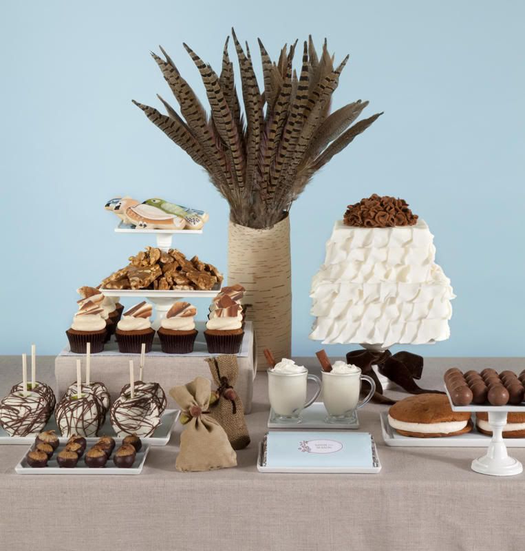
Remember this fall-inspired dessert table that I designed for Mpls St. Paul Magazine? Well, today you can visit Eat Drink Pretty to see the sketch of the table before the shoot and to print out the custom chocolate bar wrappers I designed. There are two versions of the wrapper, so be sure to check out both.
In case you missed it, you can also check out the tutorial to make the faux bois cupcake toppers. Have a great weekend!

SYDT in Mpls St. Paul Magazine!
Yesterday, I shared the cover of the current Mpls St. Paul Magazine with you. Today, I'm back with the feature. Editor Melissa Colgan's only requirement was that the table have a Fall theme. I chose to go with an unconventional color palette instead of the more expected red, orange, and yellow hues that are synonymous with Autumn. Thankfully, Melissa was on board with my concept. I hope you like it, too!
To further turn convention on its head, I made an all-white abstract leaf cake with a flowery brown topper. Custom bird cookies, these faux bois cupcake toppers, caramel chocolate apples, and pheasant feathers share the spotlight with whiskey-infused chocolate figs, white chocolate cocoa, and cinnamon truffles. I designed corduroy, burlap, and wool favor bags to bring some typical Fall fabrics to the design. I also chose chocolate brown velvet ribbon to add another cozy element.

Along with this full-page spread, the magazine also featured another page with some info about me and the firm.
 I'm really thrilled to be featured in Mpls St. Paul Magazine, and I'd like to thank the awesome local bakers and artisans who helped bring my vision to life. Check out the article for more info about each vendor.
So tell me, do you prefer unconventional color palettes or traditional ones when you decorate for the seasons/holidays?


So tell me, do you prefer unconventional color palettes or traditional ones when you decorate for the seasons/holidays?
Shoot Prepping at SYDT
Hi everyone! I'm busy today prepping for a shoot with photog Emily Steffen and stationer Bethany Hway. I'll be back tomorrow with a look at the dessert table I designed for Mpls St Paul Magazine's October issue, which is on newsstands now.
 You may remember this inspiration photo that I used to create the table and this behind-the-scenes peek.
If you're in the Twin Cities, be sure to pick up a copy. See you tomorrow!

If you're in the Twin Cities, be sure to pick up a copy. See you tomorrow!

Behind the Scenes: Mpls.St.Paul Magazine
Yesterday's Mpls.St.Paul Magazine shoot went really well, so I wanted to share a few behind-the-scenes shots that I was able to grab while we worked. The morning of the shoot, I made these faux bois chocolate rounds. They were very easy to make, so I'll be back with the tutorial for those tomorrow.
 Along with the rounds, I also brought the remnants to the set. You never know what will work best for the shoot, so it's good to bring everything. I like the sharp angles and abstract forms of these pieces.

When I arrived at the studio, I started setting up the table and unpacking the desserts while the photographer and I waited for the art directors to arrive.

 If you've never been on a commercial set, let me tell you, it's a flurry of activity. Along with the photographer, you usually also work with an art director, and sometimes there is also a stylist on set. Everyone on set has the same goal, to compose a shot that translates well in print, is impactful to the readers, and showcases the subject well.
For this shoot, I worked with photographer Steve Henke and two art directors from MSP Mag, Terri and Brian. Here, Steve and Terri (far right) check out the shot on the computer to see what adjustments we should make. Steve's daughter (left) hung out for the shoot, too.

Here, Terri and Steve make some adjustments while Steve and I study the shot onscreen.
 Although these adjustments (and there are many) can make for a lengthy shoot, I really enjoy the process. It's a very creative, collaborative environment. I'm very detail-oriented, so I get a kick out of discussing the minute details and components that go into styling a beautiful photograph.
It was great to work with everyone, but my favorite part of any commercial shoot is the food!
 I hope you all liked these little sneak peeks of my shoot yesterday. I can't wait to share the feature with you when it hits newsstands.
Tomorrow, I'll show you how to make those easy faux bois (simulated wood grain) chocolate rounds. I'll also be guest blogging elsewhere tomorrow, so I'll share that post with you as well. See you then!


When I arrived at the studio, I started setting up the table and unpacking the desserts while the photographer and I waited for the art directors to arrive.


For this shoot, I worked with photographer Steve Henke and two art directors from MSP Mag, Terri and Brian. Here, Steve and Terri (far right) check out the shot on the computer to see what adjustments we should make. Steve's daughter (left) hung out for the shoot, too.

After each shot, we all view it on the computer and make micro adjustments to improve the layout. We move things for all sorts of reasons. Perhaps a cupcake is casting a shadow that obscures a cookie or a candy dish is blocking a clear view of a platter.
Here, Terri and Steve make some adjustments while Steve and I study the shot onscreen.

It was great to work with everyone, but my favorite part of any commercial shoot is the food!

Tomorrow, I'll show you how to make those easy faux bois (simulated wood grain) chocolate rounds. I'll also be guest blogging elsewhere tomorrow, so I'll share that post with you as well. See you then!
Behind the Scenes: Magazine Shoot Prep III
Hi everyone! As you may remember, I have a magazine shoot today. I don't have a new post for you, but I'll be back tomorrow with some behind-the-scenes pictures from the set. Come back tomorrow for a sneak peek.
Check out the previous behind-the-scenes posts if you missed them.
Check out the previous behind-the-scenes posts if you missed them.
Behind the Scenes: Magazine Shoot Prep II
This week, I'm taking you all along as I design a dessert table for a magazine feature and source the items I need to bring all of the elements together. After selecting a color palette and mapping out the dessert table's design, it was time to go shopping for the ribbons, fabric, and vessels I need. First up, a stop at Jo-Ann for fabrics.
 I wanted some heavier weights for the fabric elements of the design, so I checked out the apparel section for chilly weather fabrics. These fabrics don't work for this project, but I still like to look at all of my options. Inspiration might strike that leads you in a new fresh direction, so it's always good to keep your eyes open for alternatives.
These moleskins were a better match for the warmth and texture I wanted, but still not quite right. After a lot of searching, I decided to go with caramel-hued burlap, wool, and corduroy.
 I also needed ribbon. For this project, satin and grosgrain just didn't seem to fit the warm, cozy vibe I'm looking for. But, I definitely had a lot of options to choose from.

 I grabbed a green, translucent ribbon. I'm still not sure that it will be used, but it fits the color palette and the no-fuss, down-home feel that I want.
Next, I visited Bachman's. Here, I hoped to find a flower vase that with a refined, rustic look. Bachman's is a Twin Cities-based floral and gift shop. I've shopped here for several other dessert tables, because they have a great selection of garden and outdoor decor. I loved the urns and potted ivy, but they weren't quite right for this project.
 As I walked around, I found so many ideas that would be perfect for other designs. Bachman's has lots of vintage milk glass and unusual glass bottles with cork stoppers. I'll have to remember that in the future.
 One of my coolest finds at Bachman's was this corrugated cardboard riser. It would be great for displaying glass jars full of candy, or as an eco-friendly, recyclable cupcake tower for an environmentally-focused event or client.
I still need a few more types of ribbon, so one last stop to a larger fabric store was in order. There were so many different types of trim. Suede cords, leather fringe, and bedazzled trim of all kinds. I chose a chocolate brown, velvety cord.
 Even though I didn't find the vase I was looking for (I ended up making my own last night), the trip was still totally worthwhile. I saw items that sparked inspiration for future projects, and other hard-to-find goodies.
If you follow along on Twitter or Facebook, then you already know that I also got two more Minnesota vendors onboard for the project last night. One, is Sheela of Cake Eater Bakery, and the other is a Brainerd-based crafter. Early this morning (about 6 am), I added another local baker to the team.

These moleskins were a better match for the warmth and texture I wanted, but still not quite right. After a lot of searching, I decided to go with caramel-hued burlap, wool, and corduroy.


Next, I visited Bachman's. Here, I hoped to find a flower vase that with a refined, rustic look. Bachman's is a Twin Cities-based floral and gift shop. I've shopped here for several other dessert tables, because they have a great selection of garden and outdoor decor. I loved the urns and potted ivy, but they weren't quite right for this project.


I still need a few more types of ribbon, so one last stop to a larger fabric store was in order. There were so many different types of trim. Suede cords, leather fringe, and bedazzled trim of all kinds. I chose a chocolate brown, velvety cord.

If you follow along on Twitter or Facebook, then you already know that I also got two more Minnesota vendors onboard for the project last night. One, is Sheela of Cake Eater Bakery, and the other is a Brainerd-based crafter. Early this morning (about 6 am), I added another local baker to the team.
Behind the Scenes: Magazine Shoot Prep
Yesterday, I told you a little about the project I'm working on this week for an upcoming magazine shoot. Today, I thought I'd share the inspiration picture that I'm using to help guide my design.
 The inspiration picture is mostly white and several browns, but I created a more complex color palette that I want to bring to the design. The challenge will be to add color, without taking away from the graphic impact of the deep browns against the stark white tabletop and background.
Tomorrow, I'll share show you some of the fabrics, ribbons, and papers that I'm working with for this project.
Can't wait for a little more sweetness? Follow me on Twitter or "Like" me on Facebook.

Tomorrow, I'll share show you some of the fabrics, ribbons, and papers that I'm working with for this project.
Can't wait for a little more sweetness? Follow me on Twitter or "Like" me on Facebook.
Busy, Busy, Busy
Hi everyone! There's a lot going on in the office this week. Last Friday, I met with the style editor of Mpls.St.Paul Magazine to discuss an upcoming feature. Melissa was, of course, effortlessly stylish and very friendly. She was so easy to talk to that I practically told her my life story. For those of you who aren't familiar with the magazine, you might recognize their food writer, MN native Andrew Zimmern, from the Travel Channel's Bizarre Foods. Anyway, I'm so excited to contribute to the mag, but that means a lot of prep in the meantime.

I'll take plenty of pictures as I shop for fabrics, ribbons, and papers so be sure to check in throughout the week. Next week, I'll also be doing my first guest post on another blog, but I'll tell you more about that as the time draws nearer.
I'll take plenty of pictures as I shop for fabrics, ribbons, and papers so be sure to check in throughout the week. Next week, I'll also be doing my first guest post on another blog, but I'll tell you more about that as the time draws nearer.
Subscribe to:
Posts (Atom)
