

Showing posts with label sweet brands. Show all posts
Showing posts with label sweet brands. Show all posts
Sweet Brands: Happy Lab
I love this geeky branding by confection shop Happy Lab! Test tubes, beakers, and other science-y dodads pose as candy containers, while the employees wear lab coats.
 If you can't make it to the Australian-based shop, consider adding candies to beakers and giving them to a child who just mastered a Chemistry test. I would have loved to get these after every Organic Chem test.
Sweet Brands: Thomas Haas Sparkle Cookies
Designed by Cameron Snelgar at Sorachief Design Ltd set out to redesign the box for Thomas Haas' ready-to-eat and bake-at-home Chocolate Sparkles cookies. The designer explains, "Despite the differences between the tray and the home bake box, it was important that the two packages interrelated. That provided good reason for including the angled sides on the tray. It was very important the tray fold flat for shipping; efficiently open and assemble for the delicate process of hand filling and anchor the cookies even when lifted by the cellophane. The folding tabs ensure a finished top edge and the anchoring of the cookies…they also prevent one from eating all of the cookies at once."


 It's amazing the amount of thought that goes into a cookie box. I wouldn't have ever guessed. What do you think of the Chocolate Sparkle Cookies box?
images via The Dieline
images via The Dieline
Sweet Brands: Arctic Candy
This candy is made from berries grown north of the Arctic Circle. The extreme temps make the berries even sweeter than regular berries, and this redesign by Neue puts the fruit front and center.


 images via The Die Line
Sweet Brands: Mammoth Supply Company
Think about some of the ice cream ads you've seen. Usually, they're geared to women and show ice cream as an indulgent treat at the end of a long day. Or, they show a mom lovingly giving her kids a treat. But, it's pretty rare that an ice cream ad is geared toward men. Well, when Shine set out to design packaging and ads for Mammoth Supply Co.'s ice cream, they tackled that task.
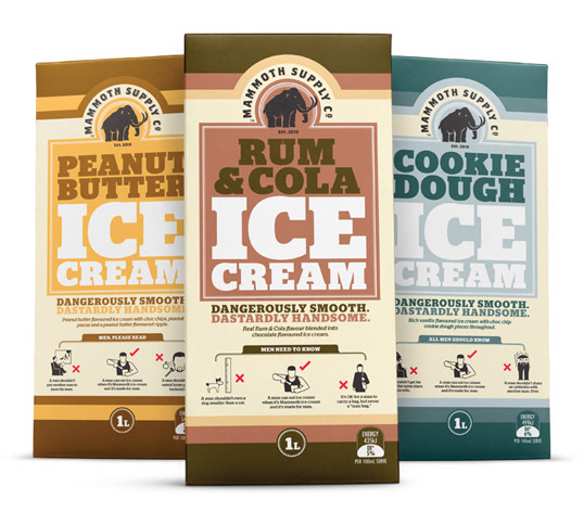
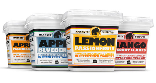
 Do you think Shine was successful in designing "manly" ice cream packaging?
If you want to see more guy-friendly Mammoth Supply Co. products, listen to the funny radio ads, or see the commercials, check out Shine's website.
images via Lovely Package
If you want to see more guy-friendly Mammoth Supply Co. products, listen to the funny radio ads, or see the commercials, check out Shine's website.
images via Lovely Package
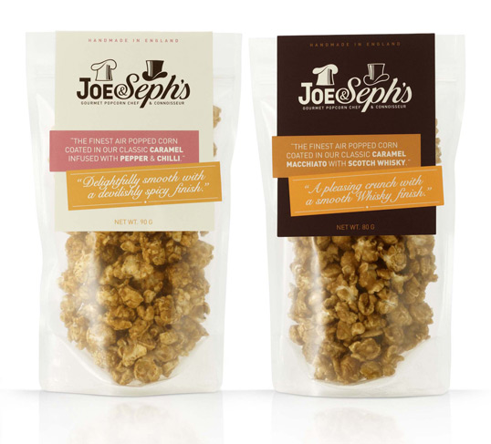
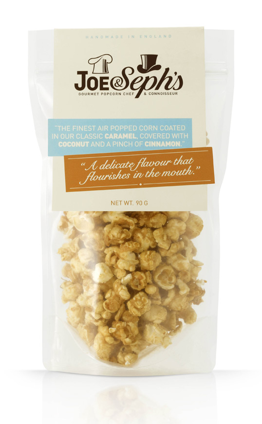
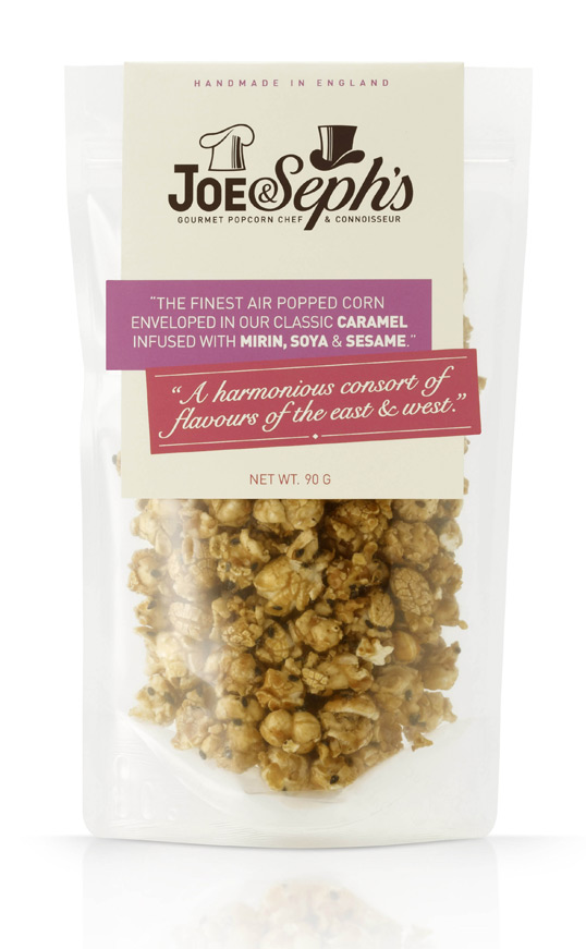
Sweet Brands: Joe & Seph's Popcorn
This week's Sweet Brands feature was designed by UK-based Designers Anonymous. They created the branding for Joe & Seph's gourmet popcorn. When owner Joseph Sopher approached the designers, he didn't have a name for the popcorn line so they were tasked with not only designing the brand, but also coming up with a name that fit the company's image.
In the designer's own words: Our solution was inspired by a Jekyll & Hyde like personality, where the chef role is represented by a chefs hat, and with a clever twist, becomes the top hat for role of connoisseur. Both roles were represented in their own typeface.
images via Lovely Package
In the designer's own words: Our solution was inspired by a Jekyll & Hyde like personality, where the chef role is represented by a chefs hat, and with a clever twist, becomes the top hat for role of connoisseur. Both roles were represented in their own typeface.
I love how much thought went into developing this packaging and the logo. The Jekyll/Hyde symbolism is cleverly executed without looking cheesy or gimmicky. What do you think of the packaging for Joe & Seph's?
images via Lovely Package
Sweet Brands: Fearless Chocolate
I'm really digging Fearless Chocolate's branding, and it's perfect for today's Sweet Brands feature. The company specializes in raw chocolate. That's right, raw. During production, the unroasted cocao beans never reach above 118 degrees (F). This means the organic goodies retain more nutrients and antioxidants than traditional chocolate. Keeping the "raw" theme in mind, the packaging for each bar isn't slick and polished and glam. Instead, it's a more natural, earthy looking sleeves. Plus, that little elephant is pretty cute.


If you loved the branding, be sure to check out the Fearless Chocolate mission. The company donates proceeds to organizations that you suggest.
Be sure to check out these other Sweet Brands.
Sweet Brands: Honey & Mackie's
I thought it'd be fun to start a series of posts that feature inventive, creative design for desserts and dessert companies. I've featured some of these posts before like this, this, and this, but today's post will be the official start of the Sweet Brands series.
Honey & Mackie's branding and collateral was designed by Minneapolis-based Wink. Here, Wink explains their objective in creating the branding.
from Wink: Honey & Mackie's is an ice cream shop for children that caters to parents. The ingredients in their ice cream creations are all natural, organic and locally grown. The name of the establishment comes from the nicknames of the owners' own children. With that in mind, we decided that the branding, design and packaging should be modern, authentic and kid fun.


 What do you think of Wink's work for Honey & Mackie's?
Honey & Mackie's branding and collateral was designed by Minneapolis-based Wink. Here, Wink explains their objective in creating the branding.
from Wink: Honey & Mackie's is an ice cream shop for children that caters to parents. The ingredients in their ice cream creations are all natural, organic and locally grown. The name of the establishment comes from the nicknames of the owners' own children. With that in mind, we decided that the branding, design and packaging should be modern, authentic and kid fun.

Subscribe to:
Posts (Atom)